CODES.crd.co
ay im codin ova hea. updated oct 20 2025.added some rather simplistic link css to the link stuff section, and removed the dead scrollbars i think i ended up losing the images for.JUST JABBERING: removed my cbox because i've been too busy to check it consistently. updates are going to be very sporadic, but hey, i'll try to drop stuff here on occasion.my links - advice for html related questions, helpful & fun links you can use for html/css which i particularly favor, and my promo code, WOJAK !mycket snart öppnas portarna till en ny dimension.
Text stuff
Text shadow
text-shadow: -1px 0 black, 0 1px black, 1px 0 black, 0 -1px black, 0 0;
Cooler text shadow
filter: drop-shadow(1px 1px 0 black) drop-shadow(-1px 1px 0 black) drop-shadow(0 2px 0 black) drop-shadow(0 -1px 0 black);
Text stroke + shadow
text-shadow: -1px 0 black, 0 1px black, 1px 0 black, 0 -1px black, 0 0, 2px 2px 8px black;
Text shadow w/ gradient
background: linear-gradient(red, black);
 -webkit-background-clip: text;
 -webkit-text-fill-color: transparent;
 -webkit-text-stroke: 1px black;
-webkit-background-clip: text;
-webkit-text-fill-color: transparent;
-webkit-text-stroke: 1px black;
Shitty vertical text
writing-mode: vertical-rl;
 text-orientation: downwards;
text-orientation: downwards;
Text stroke w/ selection border
filter: drop-shadow(0px 1px black) drop-shadow(0 -1px black) drop-shadow(1px 0 black) drop-shadow(-1px 0 black);
Fading text
filter: drop-shadow(0px 1px black) drop-shadow(0 -1px black) drop-shadow(1px 0 black) drop-shadow(-1px 0 black);
ok theres just a bunch of really awkward blank space down here so ill just show you what the shit above is supposed to actually look like
More drop shadowfilter: drop-shadow( 0 1px black) drop-shadow( 1px 0 black) drop-shadow( 0 -1px black) drop-shadow( -1px 0 black) drop-shadow( 0 2px white) drop-shadow( 2px 0 white) drop-shadow( 0 -2px white) drop-shadow( -2px 0 white) drop-shadow( 0 3px black) drop-shadow( 3px 0 black) drop-shadow( 0 -3px black) drop-shadow(-3px 0 black) drop-shadow(1px 1px 0 red) drop-shadow(-1px 1px 0 red);
More Tumblr wobble, curved text, bouncy text, bouncy letters, rainbow text, glowing text, scramble text, marquee, marquee that pauses on hover, tooltip, tooltip that follows cursor, custom text highlight, marquee with wobbling textStuff kinsta went ape shit over in '21 popping text, horrible shaky text, floating text, awful glitchy text, bro just look at MF2FM
Scrollbarsstill a wip. Only visible on desktop :< apologies to those on mobile.note: you cant see/use any of these on firefox.also you can make your own here. fun!
Log
Scroll bih
Recent updates
DECEMBER 30 2022 - ok i give up on logs because i ju-- (fart sound plays)yeah i forgot to add an update to the log multiple times now so i give upDECEMBER 19 2022 - splattered a fresh coat of paint onto this nightmare of a carrd, added more shit
Older updates
NOVEMBER 29 2022 @ 7:03 AM - finished most of it. Finally unpriv'ing.... i guess. nvm the layouts ugly again
NOVEMBER 29 2022 @ 4:07 AM - restarted construction on this carrdSomewhere in early to mid november '22 - started working on this carrd but made the layout too complicated. Scrapped.Uhh... i got this url in... january of '22? either that or april. i have no fucking clueok not jan or april nbecause thats when the codes.crd.co twf kys pic was still up. prob like july or something then

Pic stuff
So this page previously had more than 4 examples but it caused terrible load issues both in the builder and on the world wide web as a site i use. Rough stuff.


More CLASSIC white lace border, Fun frilly pink lacy border, desaturation on hover, hue rotate on hover, rainbow outline, image rotate on hover, rainbow border, triple outline, normal outlineEXTRA! animations
Link stuff
Admin's comments the squiggle link, for lack of a better term, is frustrating to customize and i entirely forgot how to do so... so an explanation on that will be put on the backburner for a little while longer
TutorialsA crash course in learning gridHow to center container divsAdding sound effects to images
(pro plus only, ill write a tut for standard at some point)Adding custom fonts to carrd (friendly to both pro plus & standard)How do i do custom cursors please i need helpQuick guide to tooltip (pc only)MY MARQUEE IS TOO SLOWadding sound effects to elements on hover/clickWarning: im fresh ass at explaining but i swear im trying
Learning gridand what is grid, you - who im sure hails from kinsta or kpop twitter - may ask?Grid is just a nice layout system you can use to position elements next to each other in a neat and orderly fashion, which is quite simple to boot - the only problem ive had with grid is misspelling its properties like a dumbass.Now then, ill get into the basics.1. Make a container div.
pretty simple stuff, but ill make it even simpler for you.
Paste #cont {
display: grid;
grid-template-columns: 50% 50%;
} in between your <style> & </style> tags.
#cont is your selector which you will use in your html to contain the elements going into it!display: grid; is what makes the property below it work - you need this property & value to make the stuff below do what it needs to do.grid-template-columns: 50% 50%; is where the real magic happens - i used 2 values in my example to give you 2 columns, but you can add even more via adding more numbers. the numbers themselves define your individual columns' width, which can be defined however you please in em, px, auto, and whatever else width values you can think of.2. make your column divs.
you can make your columns share the same div (which ill be doing), but you can make them use different ones! now, onto my example.
Paste #column {
} below #cont, still within your style tags. with your css knowledge, you can give your columns heights, borders, backgrounds, paddings, overflows, you name it!3. Enough talk, time for the html.
below your style tags and now within <body> and </body>, write your html.
I should probably challenge you with this, but im complete ass at explaining so i'll just paste the html here.
now, paste <div id="cont">
<div id="column"></div>
<div id="column"></div>
</div>
between your body tags, and youll have your ticket to the city. you now have your grid base which you can design however you like, and fill with whatever nonsense you can think of."but admin, how can i make my columns have a space between them? If i use a border they look like shit clumped together like that." Fear not, young student, for there is a property for that.
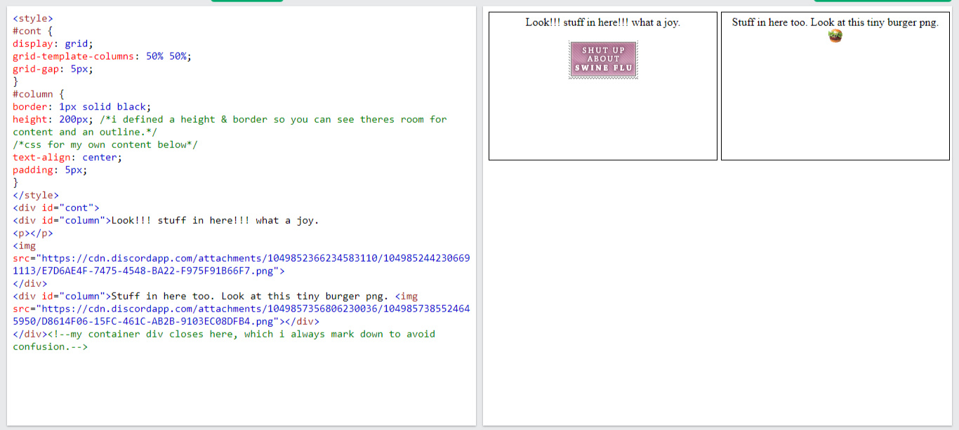
grid-gap: 5px; is what youre looking for, but feel free to change that 5px to literally anything else. paste this into #cont.now, my apostle, make something real neat and clean with this knowledge i have bestowed upon you.My example is below - i used W3Schools to test this out, which is also shown in the screenshot.
display: grid;
grid-template-columns: 50% 50%;
}
}
<div id="column"></div>
<div id="column"></div>
</div>
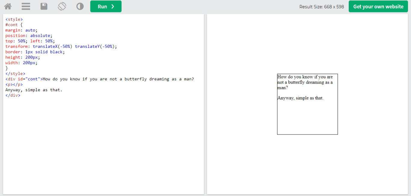
Centering container divsPretty easy stuff, just paste this into your container div's css.margin: auto;
position: absolute;
top: 50%; left: 50%;
transform: translateX(-50%) translateY(-50%);This should be your result below.
position: absolute;
top: 50%; left: 50%;
transform: translateX(-50%) translateY(-50%);
Misc stuff
Box shadow cool fun border (weehee)
box-shadow:inset -1px -1px #0a0a0a,inset 1px 1px #dfdfdf,inset -2px -2px grey,inset 2px 2px #fff;
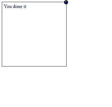
box with pixel making it draggable (on pc). do whatever w this man. linkTyping tab titleMarquee tab title
(^ ill add previews + a quick tutorial on these two soon) also if you have the bouncy tab title feel free to direct me to a pastebin/w3 link so i can slap it here too
Scratch filter + demo
NOTE:this doesnt look right on mobilevhs text + "demo"flip card + "demo" + aboutflicker filter + "demo" + quick guideflicker w cool text + "demo" + guide98.css, xp.css, and 7.css**Note: 7.css doesnt work on carrd
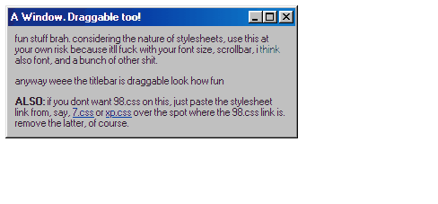
draggable (on pc) 98.css box - alternate link to the gif above here because i wrote instructions in that thing and carrd crunched my shit up. link
Chat
i still check here semi-regularly, so even if i don't reply, i read everything! :-D
Fonts
wip for now im bored
Flip cardsyeah this is for the people who can hold their own with html/css. i linked some random dudes version on codepen instead of the pastebin ver linked on callie because for some reason, the pastebin ver wouldnt work for me.anyway the entire gimmick of this is to hover over, like, an image you can paste in, then itll flip over to whatever the fuck you want really.i made the back a wacky little about page because i was bored and wanted to do something i could add to this carrd. for my ""demo"", i used grid, a little bit of absolute positioning for the feelsjak, a single marquee, a couple of spans and even a few hovery things because i like them. also the custom text selection you can find here.idk i just thought this was rather neat because its essentially a catalyst for whatever you wanna make! aside from maybe fucking up the base html you shouldnt mess with, i doubt youll have too many problems with this one. base you can immediately start customizing here.i'll get to writing a tutorial on this soon i swear
Flicker effect/filterthis is another thing for those who can easily write their own html/css. also, i tested this out via just pasting it in an embed on carrd and it works! go nuts broanyway, just paste all your shit, artfully craft a container div, and make sure to write <div id="wrapper"> before you do anything. close this tag with </div> and write whatever you're trying to make between these tags!you can also put <div id="wrapper"></div> before the rest of your html. it won't hurt anything. just put it wherever you'd like, as long as the div starts before anything else.NOTE: use this with a dark background.here's what your code should look like below.

Flicker with cool textbasically just follow the instructions youll find here but replace "wrapper" with "crt".here, ill make it even easier for you.<div class="crt">
<!--your content goes here, whatever you put between these 2 div tags will be under an overlay effect and text will have like a warp effect i guess-->
</div>NOTE: use on a dark background. unlike in the instructions i linked, make sure to use "class" instead of "id".also, this is carrd friendly and should automatically convert text without strokes or shadows to the flickery fun shit.
<!--your content goes here, whatever you put between these 2 div tags will be under an overlay effect and text will have like a warp effect i guess-->
</div>
Pooh's Adventures of MEHello dear friend im the admin of this carrd hee haw what a joynot much to say about little ole me.... i like music, watching movies i dont like and getting mad at them, the occasional video game, bkah blah blah.carrd hereanyway theres a couple of things i made down below. i dont make much shit anymore so i dont have too many things to show offfeel free to remake or take inspiration - just show me what you made because i think itd be neat! :-D


Music stuff
no live previews. anyway, below all this, ill write a quick guide on how to use your own songs


Admin's comments yeah i got midway through this then saw someone on neocities has every music player to have ever existed listed there so im just gonna casually direct you to scripted if none of these catch your eye.Guide its pretty simple to drop your own songs in here.<audio id='musicsrc' loop src='put your shit here'></audio> there you have it. just paste your link in between the apostrophes or quotation marks.in order to HOST the file you want in there, i recommend dropbox or catbox - once youve uploaded your file, click around for the link.if youre using dropbox, now you have to edit your link a bit, otherwise it wont work. hey, stay with me here.look at this link. https://www.dropbox.com/s/9n6kg83z8nqdnm9/reverb.mp3?dl=0okay, now remove the 'www' and replace it with 'dl', then remove the '?dl=0' tacked onto the end. your link should now look like this.https://dl.dropbox.com/s/9n6kg83z8nqdnm9/reverb.mp3also, no, i did not shamelessly plug my favorite song or whatever. its a link to a rather amusing fart sound that echoes.anyway, there you have it. simple as that.
Adding sound effects to images on click (pro plus only atm)
fun stuff. anyway now for the actual tutorial to startFirst things first - you need the link to your sound effect/song/whatever.
at the bottom of the music section i wrote a little tutorial on where to upload your files & what to do with the links! id kindly suggest you check it out if youre new to this kind of stuff.anyway, once you have your link looking like this
https://dl.dropbox.com/s/zcxcm788quzwjo2/sh2%20item%20pickup%20sound.mp3 with "www" replaced with "dl" and youve removed the "dl=0" from the end of it, youre ready to go on ahead. catbox users dont need to worry about this step.paste
<audio id="sound" src="Dropbox Link Here" preload="auto"></audio> into an embed and replace "dropbox link here" with the link you have.now, add an image to your carrd.navigate to the settings of this image and click events.alright. now paste this into that text box.
document.getElementById('sound').play();and youre done!you can add as many sound effects as you want to your carrd, all you need to do is replace the audio id ("sound" by default) with some other word and edit your events code snippet's 'sound' to whatever youve changed the audio id to.
Quick guide to tooltip (this only works on desktop - sorry mobilebros) NOTE: REQUIRES HTML & EMBED USAGE. finished on 6/30/2023what the fuck is tooltip? considering you should probably only be reading this if youre able to use it, hover over an application on the taskbar at the bottom of your computer screen. after a moment, the application's name will pop up within a white box. that, my friend, is tooltip.getting into the good stuff ok so for this im gonna be using this snippet - it follows your cursor as it rakes over the respective element you slapped tooltip on, then disappears once you stop hovering over the element.in terms of customization, anything below style and design is open season.ok now ive got that off my back lets get into the technical shit.most people just use tooltip for images, links and regular text that can be hovered over. i had live previews for these examples but the javascript made my site load time super fucking bad... curious!
you can slap tooltip on just about any element in html. spans? sure. text customizers like em, strong and strike? go for it. entire ass divs (like containers or whatever)? you got it bro.<a href="#" data-toggle="tooltip" title="this is where you insert the tooltip text" class="">hey lois its peter if you need any extra help my cbox is always open</a> is the format for adding tooltip to elements - <a> is just an example element you can wedge data-toggle="tooltip" title="this is where you insert the tooltip text" class="" right beside in the first tag.and thats that! i hope i didnt explain this too clumsily - i dont even know where ive been for the past month
Importing custom fontsi feel like most carrders know this but i havent updated in a couple of days sooooooo here you go i guessstep one. find your font
just scroll thru sites like dafont and download whatever shit you wantstep two. upload that shit to dropbox/catbox. like usual, any dropbox links need to have "WWW" changed to "DL" - and remove everything after ".TTF, .OTF or .WOFF".step three (pro plus). make an inline embed in carrd and paste this into said embed
<style>
 @font-face {
 font-family: font name here;
 src: url(put your link in between these brackets);
 }
 </style>
You can change "font name here" to anything really, it doesnt matter all that much. The only reason why you might want to make the font name more specific is if you're loading multiple fonts in and want to keep track of them.step four (pro plus). navigate to the text you want to slap your custom font on, select settings, go to styles, then paste font-family: font name here; into text. it should be at the top.
you should be good after doing this step.step three (pro standard). if you want everything on your carrd to be the same custom font, i gotcha.
replace the pasty shit above with <style>
body {
font-family: font name here;
}
@font-face {
font-family: font name here;
src: url(put your link in between these brackets);
}
</style> into your embed and everything on your carrd should be the same font.
note: if youre gonna change "font name here" to something else, make sure to change it everywhere instead of just in font-face because if you change it in just one spot it wont work.if you want some text to just be that font instead of the whole ass carrd, just paste this into an embed.
<style>
 #txt {
 font-family: font name here;
 }
 @font-face {
 font-family: font name here;
 src: url(put your link in between these brackets);
 }
 </style>
 <div id="txt">ehehehe look lois im html in an embed on carrd</div>
obviously replace the family guy bit with whatever you want your text to say.Note: where the embed here is placed matters because if you place it at the top of your builder your text is gonna be at the top of your page. if you want it in a container, place it exactly where you want the text in the container."But admin! i cant customize my embedded text like i can in the regular carrd text styler, its just black text thats kinda small!" Look over here for the absolute basics on customizing the text in "#txt".
@font-face {
font-family: font name here;
src: url(put your link in between these brackets);
}
</style>
body {
font-family: font name here;
}
@font-face {
font-family: font name here;
src: url(put your link in between these brackets);
}
</style>
#txt {
font-family: font name here;
}
@font-face {
font-family: font name here;
src: url(put your link in between these brackets);
}
</style>
<div id="txt">ehehehe look lois im html in an embed on carrd</div>
The most basic of CSS basics - text edition
this ones gonna be fun.you can only use one text-align value but anything else here is fair game. make your text as cool as possible.
text-align: left;
text-align: center;
text-align: right;
background: lightblue;
color: red;
border: 1px solid black;
font-size: 1.5em;
font-weight: bold;
font-style: italic;
font-family: jokerman;
Ext. these are just things i can think of off the top of my head - you can specify whatever color you want really, and you can also use hex codes + rgb.mess around with the size of your text too. the lower the value (like, say, 0.75em), the smaller your text will be. U can use px too!i believe by default your embedded text will be aligned to the left so if you want it aligned differently just fiddle around with the things i pasted up top.you can also slap anything from text stuff in between "#txt"'s brackets, but i made this section for the most bare-bones of basics.
AdviceQuick link to choosing fonts and site color schemes here.Should i get carrd pro standard or pro plus?Tbh id say you should only get plus if youve fallen down the html/css rabbit hole and also want as much convenience as possible - you can do some pretty neat shit with pro plus especially with utilizing markdown and basic css to make text dope as hell while not even using embeds. Fun stuff.How do you get into html/css?Personally i got into it because it looked fun and you can customize the absolute shit out of whatever you make so if that sounds appealing to you....... go for itI started learning via w3schools and looking at their visual tutorials while completely ignoring the written guides as im a visual learner.Also as i said a while back, early on i started making my own shit via frankenstein-ing other peoples stuff and seeing what worked and what didnt work. Also mozilla.org helped me a fuck ton and tbh i still use it when i need help!Theres no shame in not knowing how some things work and tbh i miss when i had no idea how to do ANYTHING so i just absolute positioned the hell out of everything i made.
LinksIf youre looking for ways to stylize your links, youre at the wrong page - here is where you wanna goHelpful html/css sites
w3 tryit editor
w3schools as a whole actually
developer.mozilla.org
lovespace carrd! U can find some really cool stuff here
HTML basics carrd
into HTML written by one of the old codes.crd admins
HTML cheat sheet
CSS cheat sheet
CSS filter generator
CSS striped background generator
CSS gradient generatorMisc. sites and bookmarks
ublock origin (best adblocker in the world)
web archive
follow that page (track site updates)
screentogif (best application for gif recordings and ive used it for multiple years now)
Animations
(these can also be used on text but i cant imagine why youd want to use most of these like that)also i forgot to clarify these on display are for pro plus by default but if you replace ".weeble" or whatever with your image's id (like #image01) it should be all fine and dandy


More i did not want to display because youve already seen them a million times and some look AWFULFloating image, shaky image, "popping" (...?) image, goofy rotating image, glitchy ugly image, aaaand image just eternally spinning around
Adding custom cursors to carrd or html desktop only btwwell this ones pretty simple id say.look at this css snippet.<style>
html, a, a:hover {
cursor: url(https://64.media.tumblr.com/fa5e0737f465ad2f7c591df98c0496e0/e421920703343e33-44/s2048x3072/35f8e0a121325b0901b4aa09abb03df9ae721082.png), auto;
}
</style>by default its a knife but if you replace the unfeasibly long link wedged in between the parentheses with whatever you want your cursor to be (though you kinda need to upload your png somewhere like discord, catbox or dropbox), youll have whatever you want really.if you dont want to make like a hamburger cursor or some bullshit like that and instead just want the funny question mark thing that pops up on links and shit, here you go.<style>
a:hover {
cursor: help;
}
</style>theres other cursors like the question mark that dont require a link to an image and simply require whichever word that will specify them. heres a link to a list.also you can go look at cursors-4u to find a real zinger custom cursor. if youre on carrd, use the universal css/html code you see pasted above the stylesheet code.if you have access to a stylesheet, well... im sure you know what to do.
html, a, a:hover {
cursor: url(https://64.media.tumblr.com/fa5e0737f465ad2f7c591df98c0496e0/e421920703343e33-44/s2048x3072/35f8e0a121325b0901b4aa09abb03df9ae721082.png), auto;
}
</style>
a:hover {
cursor: help;
}
</style>
Nothing much, you?
Bookmarks
misc. resources you might find fun or helpful.
i have another page with a similar purpose here! it has more simple html/css resources, but this page exists so i can clear out my chrome tabs... i have over eighty open as i type this... please help me.
How to change marquee speedsAnd no, im not talking about Marquee Moon by the American rock band Television. Im talkibg about fun text that moves across your screen.Alright so heres your html snippet
<marquee behavior="scroll" direction="left" scrollamount="15">
 That's an insult to the PEZ community.
 </marquee>
Check out the scrollamount="15" bit. This ones easy as fuck: replace that 15 with a higher number if you want it to be so fast you probably cant even read it. I think the default speed without defining a speed is ... 10?Here let me dumb it down for you like crazy.Higher number than 10 = faster than default speedLower number than 10 = slower than default speedWANT IT EVEN MORE DUMBED DOWN? I feel like im in a tim and eric skit but here we go.Bigger number = fasterSmaller number = slowerSO THERE YOU GO! also the text in that snippet is from what is probably my favorite scene from Pawn Stars. I need to bring back the embedded corner video on desktop for that one
That's an insult to the PEZ community.
</marquee>